Mapping a system

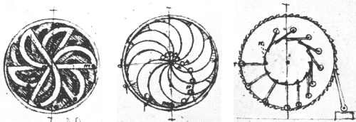
I saw this picture in a book when I was eighteen. It is a “perpetual motion wheel,” designed by da Vinci. I visualized and built a version of the machine in the middle when I was twelve. It took thousands of attempts to come up with this design. I started with a straight line and bent the marbles into position in my mind so I could fund the optimal curvature. I knew it would stop spinning because I have a model of “the motion of marbles” in my mind. At the time, I had never heard of “perpetual motion,” but I knew it was impossible because I knew the sound of a marble was related to the rate at which it slowed down. Since I could hear the marbles in my imagination, I knew it would stop spinning. I built it in my basement because I couldn’t model how long it would spin before it stopped. I wanted to find out, so I built it to know for sure. My system spun for less than two seconds. I was happy that I learned from this system.
Everything can be understood by mapping it to six perspectives at snapshots in time. The perspectives are:
How much - a quantity of value
How the system works - a flowchart that describes the process
What is happening - the performance of each step in the flowchart
Why it is happening - the rules that define the relationship between energy and information
Who is it happening to - the Who/What that are doing the processes at each step
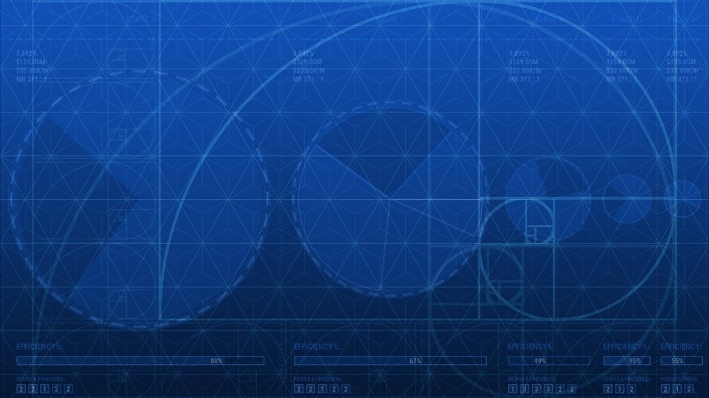
This compares a machine in motion with business system in motion. Both systems move energy. The machine on the left is converting potential energy into kinetic energy. The machine on the right is converting potential money into kinetic money. All systems work the same way.
I visualize spatially accurate models of systems in motion and take “snapshots” of them in various positions at intervals in time. Business systems can be visualized in a scale model in the same way a marble rolling down a ramp can be visualized in a scale model. Energy is money in motion (measured in dollars per hour). The information is the result of the processes that move the money. The rules are described by the performance of the people doing each step of the process.
This is the story of how I translated a 4-D spatial model of a business system into a visual representation of gears (money), processes (flowcharts), and people (performace at each step in the process).
A more detailed version of this story is here:
https://businessvisualization.com/mapping-an-energy-and-information-system/
I learned about energy transfer doing experiments with marbles and ramps in my room in 1980. I rolled thousands of marbles down ramps at different heights. This taught me position, velocity, acceleration, momentum, and friction. The sound of a marble rolling is proportional to the energy loss due to friction. I could see this in a four dimensional, color-coded spatial model that does not contain words and has no access to language. It can be described by thermodynamics and calculus.
The distance between the marbles and the vertical center axis is always the same. That’s why it is in balance at every snapshot.
My mind can simulate machines in accurate models. It took me thousands of attempts to picture the ramps and bend them into the optimal shapes. I visualized this machine in 1980, but I built it in my basement in 1982 because I wanted to see how long it would spin before it stopped.
